[tatsu_section bg_color= "" bg_image= "" bg_repeat= "no-repeat" bg_attachment= "scroll" bg_position= "top left" bg_size= "cover" bg_animation= "none" padding= '{"d":"0px 0px 0px 0px "}' margin= "0px 0px 0px 0px" border= "0px 0px 0px 0px" border_color= "" bg_video= "0" bg_video_mp4_src= "" bg_video_ogg_src= "" bg_video_webm_src= "" bg_overlay= "0" overlay_color= "" full_screen= "0" section_id= "" section_class= "" section_title= "" offset_section= "" offset_value= "0px" full_screen_header_scheme= "background--dark" hide_in= "0" key= "BJ-wrcLdIm"][tatsu_row full_width= "0" no_margin_bottom= "0" equal_height_columns= "0" gutter= "medium" column_spacing= "px" fullscreen_cols= "0" swap_cols= "0" row_id= "" row_class= "" hide_in= "0" layout= "1/1" key= "r1lDHcUOUX"][tatsu_column bg_color= "" bg_image= "" bg_repeat= "no-repeat" bg_attachment= "scroll" bg_position= '{"d":"top left"}' bg_size= '{"d":"cover"}' padding= '{"d":"0px 0px 0px 0px"}' custom_margin= "0" margin= '{"d":"0px 0px 0px 0px"}' border= '{"d":"0px 0px 0px 0px"}' border_color= "" enable_box_shadow= "0" box_shadow_custom= "0 0 15px 0 rgba(198,202,202,0.4)" bg_video= "0" bg_video_mp4_src= "" bg_video_ogg_src= "" bg_video_webm_src= "" bg_overlay= "0" overlay_color= "" animate_overlay= "none" link_overlay= "" vertical_align= "none" column_offset= "0" offset= "0px 0px" z_index= "0" column_parallax= "0" animate= "0" animation_type= "fadeIn" animation_delay= "0" col_id= "" column_class= "" hide_in= "0" layout= "1/1" key= "HyDB5IdI7"][tatsu_text max_width= '{"d":"100"}' wrap_alignment= "center" animate= "" animation_type= "fadeIn" animation_delay= "0" key= "Sk-MjLdLm"]
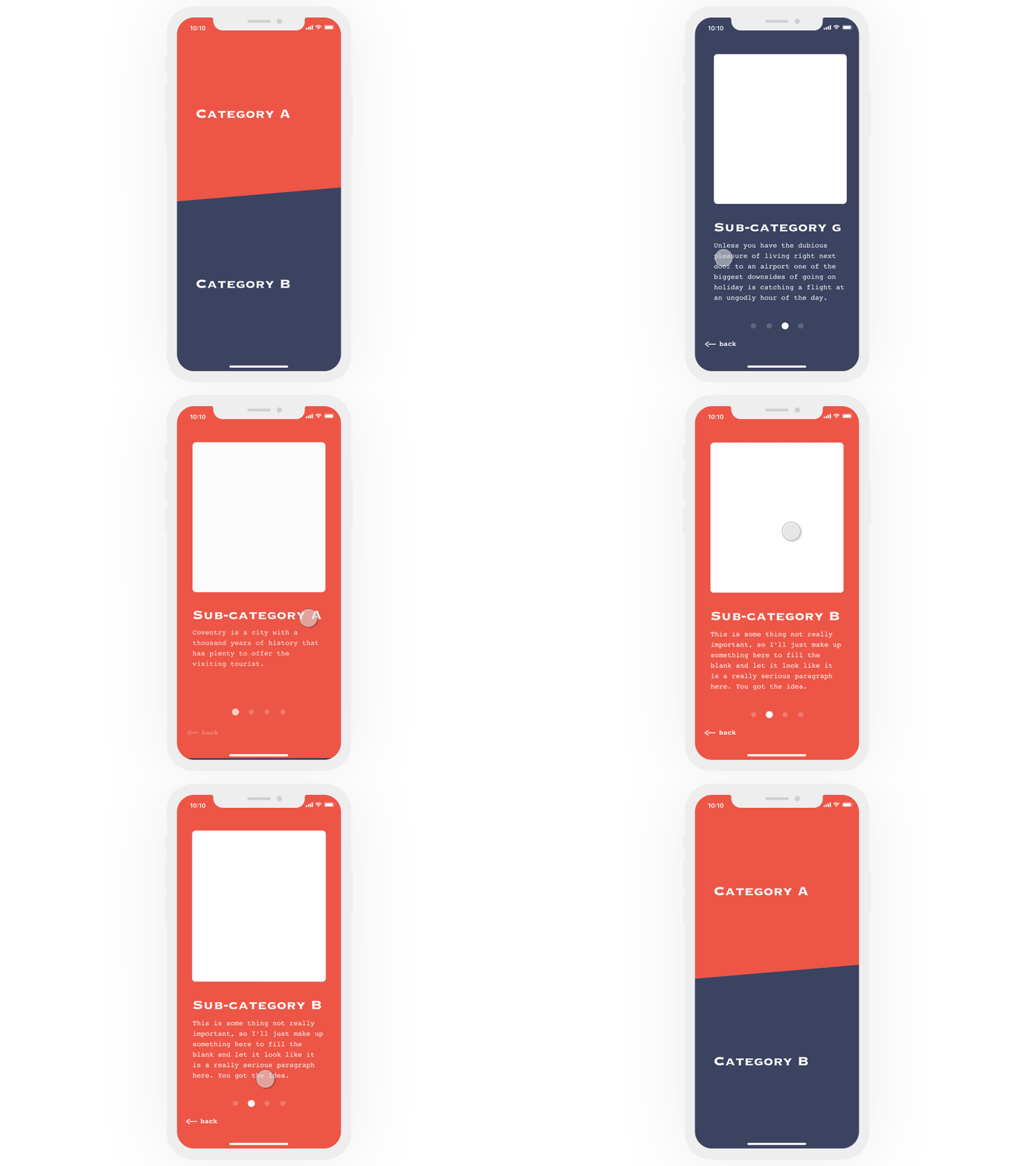
This is a nice example of smartly used transitions. The pull-down gesture is my favorite thing about it. This Dribbble shot was done by Enzo Yu Deng.
[/tatsu_text][/tatsu_column][/tatsu_row][/tatsu_section]

No Comments.