
Thanks for stopping by!
Hello, I'm Matthew and I'm a designer living in Atlanta, GA. I created this site to share inspiring content and to write a bit about my experiences in the industry.
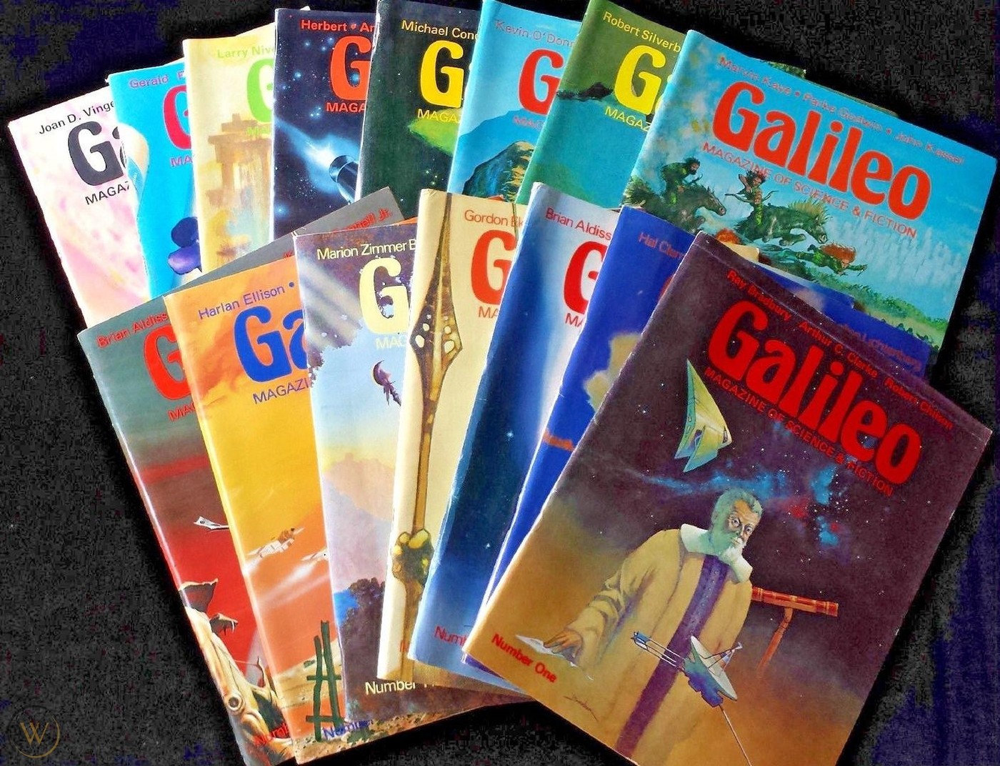
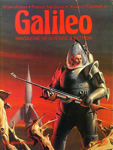
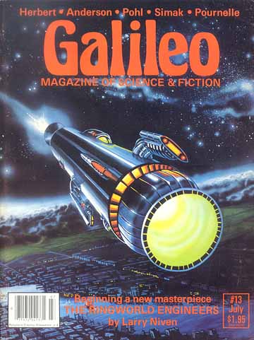
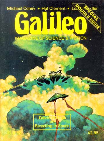
The Galileo Magazine of Science and Fiction ran in the late 1970’s and featured a masthead set in Herkules, an Art Nouveau inspired typeface with distinctive organic curves. The vividly illustrated covers work really nicely with Herkules, making the whole package reflect how the 20th century space race ignited our collective imagination.
Learn more about Galileo Magazine of Science and Fiction
Source: Fonts in Use
Hello, I'm Matthew and I'm a designer living in Atlanta, GA. I created this site to share inspiring content and to write a bit about my experiences in the industry.